Brand & Packaging Design
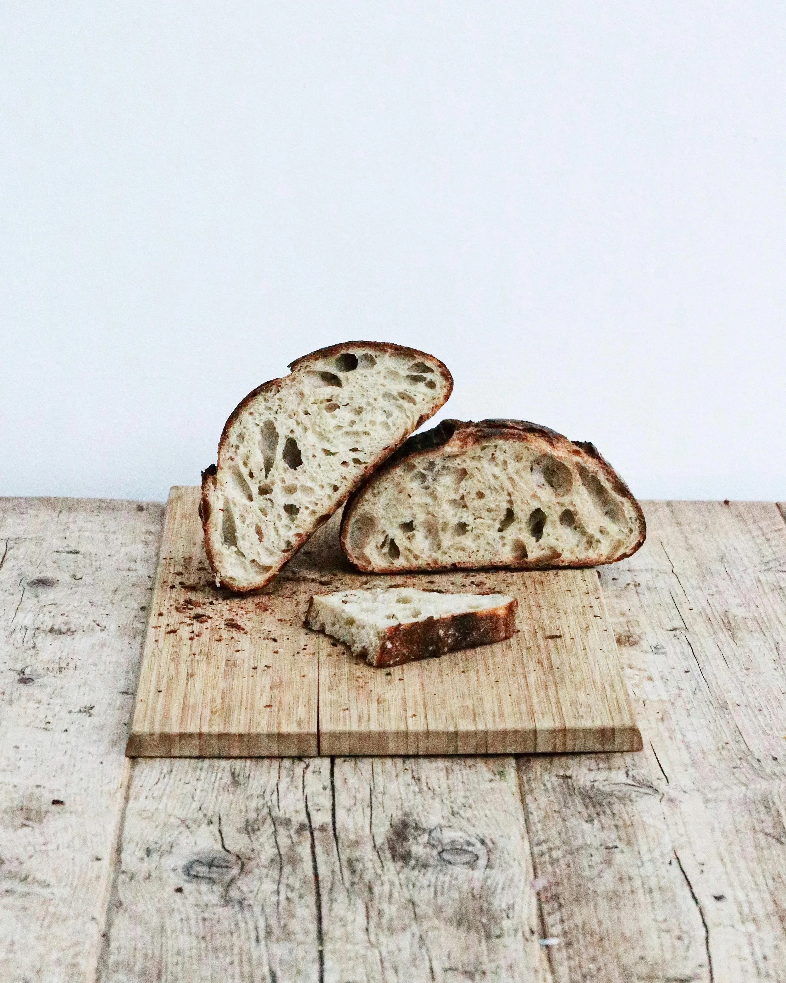
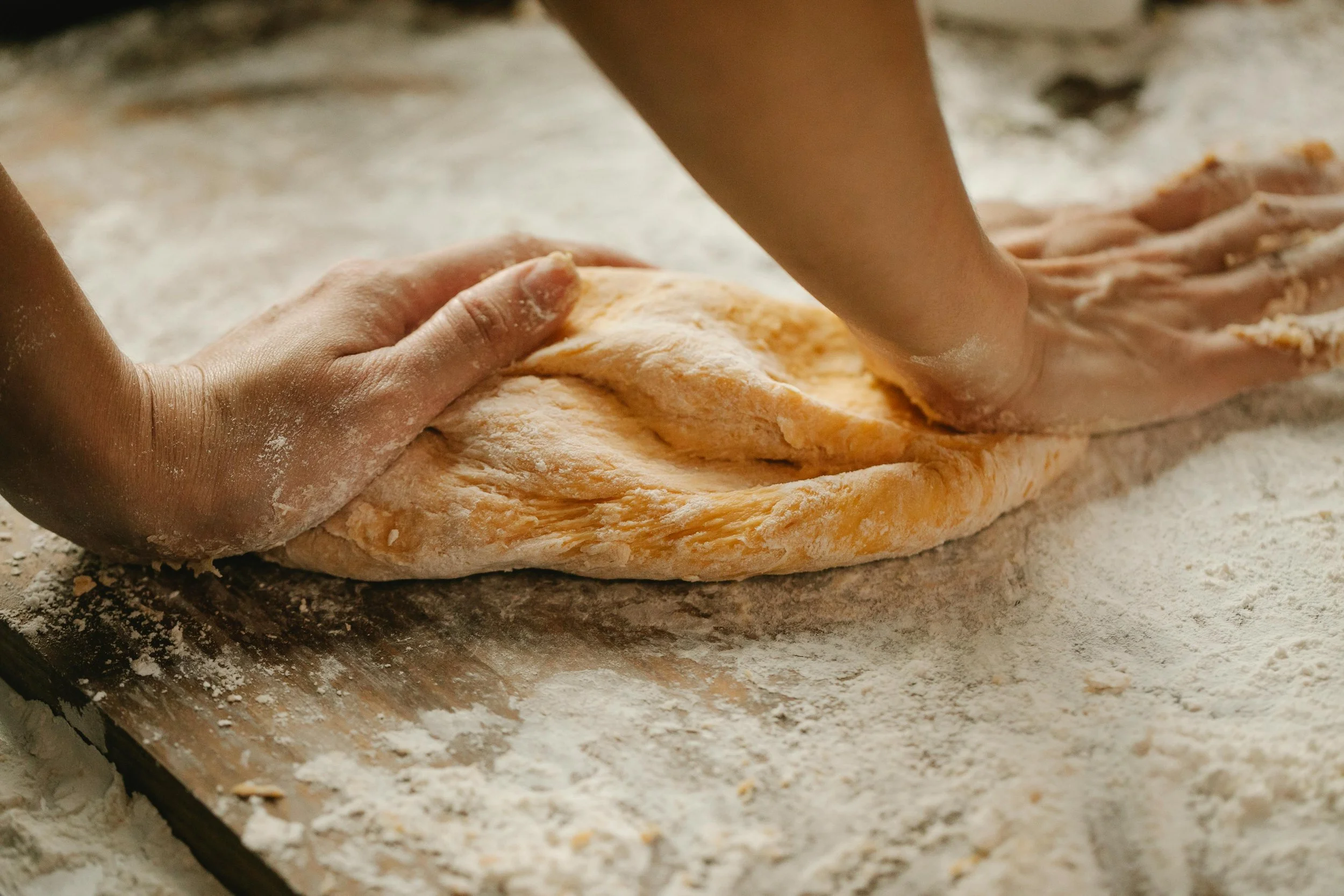
Knead is an Arizona-based cottage bakery founded by Cindy Sawyer, specializing in fresh, home-baked sourdough loaves with a rotating menu of new offerings each week.
Knead Cottage Bakery approached me to develop their initial branding package, marketing collateral, and packaging solutions. After thorough consultation, discussion, and direction through mood boards, I created and implemented a cohesive branding package that was applied across all company assets
Sector:
Food & Beverages
Services Requested:
Full Branding & Packaging Design
Roles:
Logo creation, mood boarding, concept creation, branding design, packaging conception, production artwork, & final presentations
Tools:
Google Docs, Illustrator, InDesign, Procreate, Canva
Team:
Self Directed
Duration:
January 2024 – Present
Mood Board
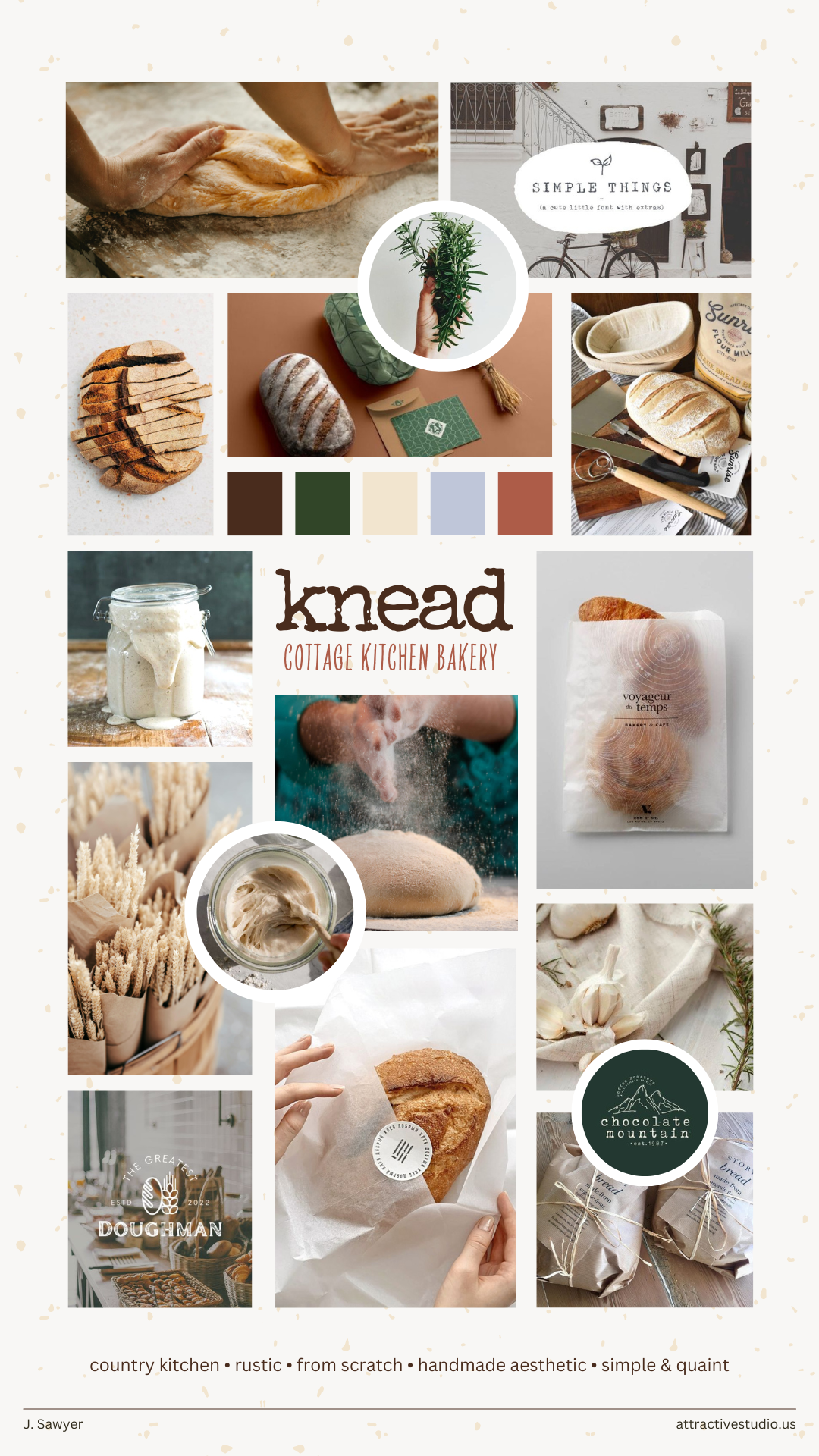
After our initial discussion about the brand’s goals and needs, I developed a mood board to align with my client’s vision. The board featured visuals that embodied a country kitchen feel, with rustic, from-scratch elements that conveyed a simple and quaint atmosphere.
Along with the proposed color palette options, these themes captured the desired mood. With Cindy's feedback, we refined the mood board to establish a brand direction that perfectly resonated with her objectives.
Brand Guide
Once the mood board direction was finalized, I began developing the assets for Knead. The brand concept centered around the themes of a country kitchen and a creation from scratch while maintaining a simple and quaint aesthetic.
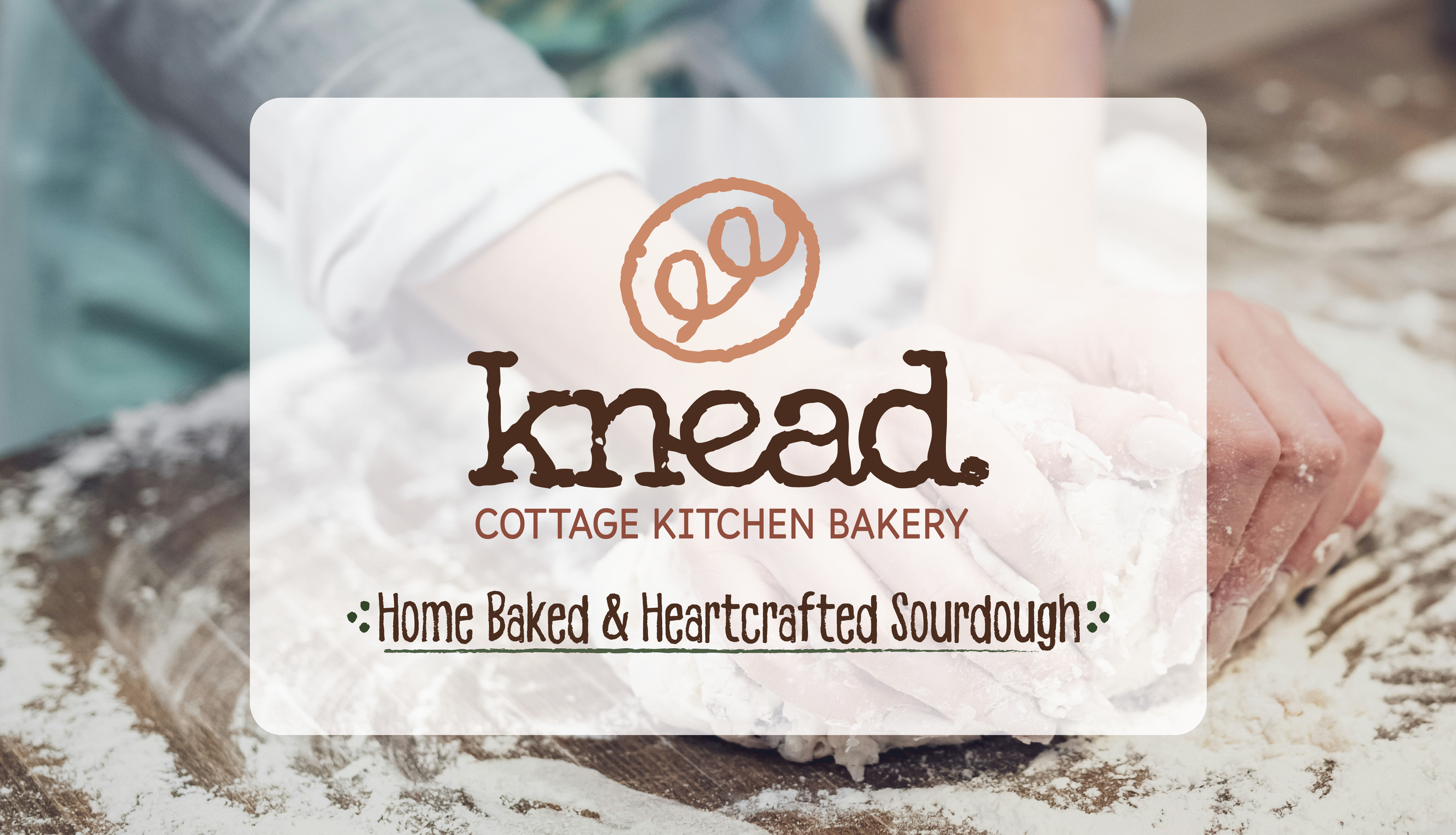
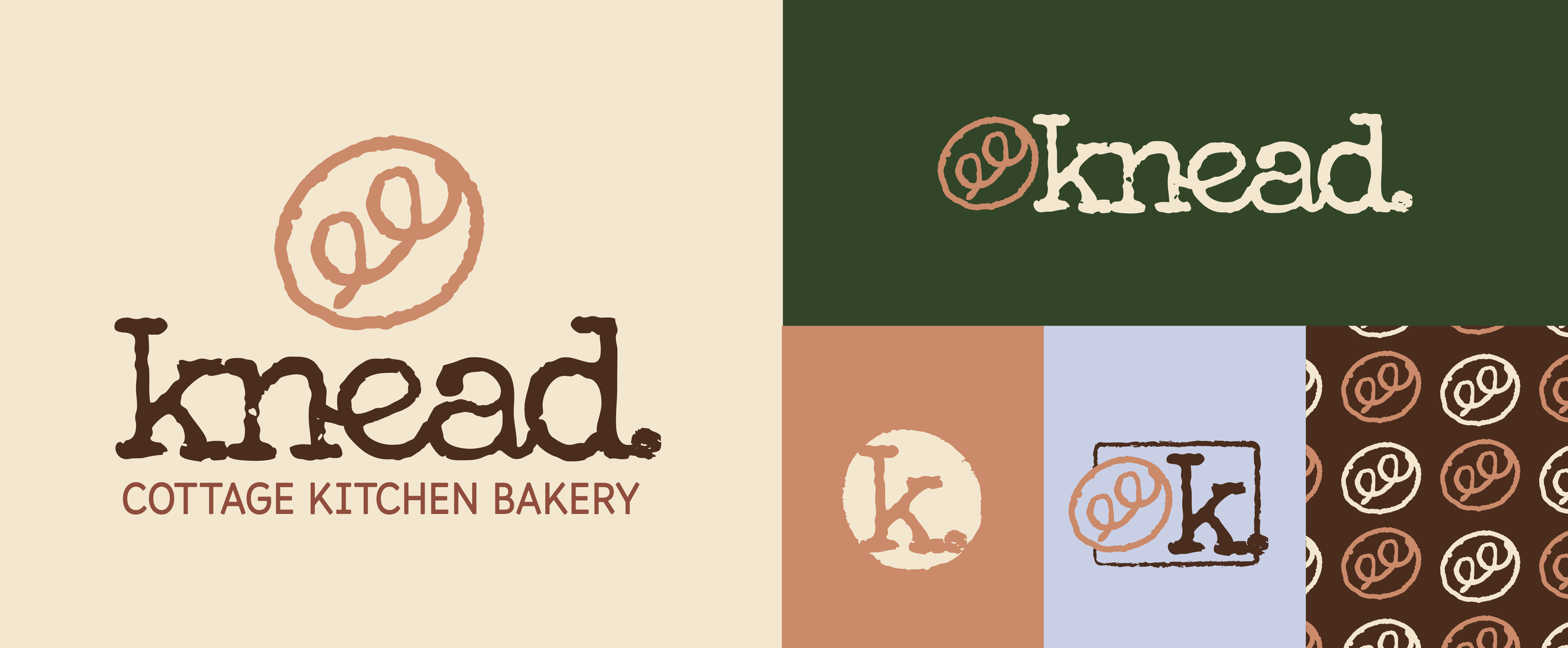
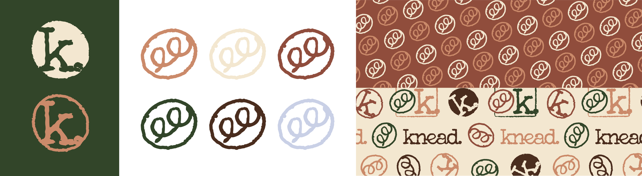
Logomark
Knead Cottage Bakery’s primary logomark was thoughtfully designed to embody the essence of a rustic, from-scratch approach, capturing a simple and quaint aesthetic that resonates deeply with the brand’s values. This design reflects Cindy Sawyer’s commitment to crafting fresh, home-baked goods with a country kitchen charm. Complementary secondary marks were developed to maintain brand recognition while enhancing versatility and readability across various platforms. These streamlined versions of the primary logo ensure that the brand remains consistent and impactful, whether in print or digital media, adapting seamlessly to different sizes and applications.
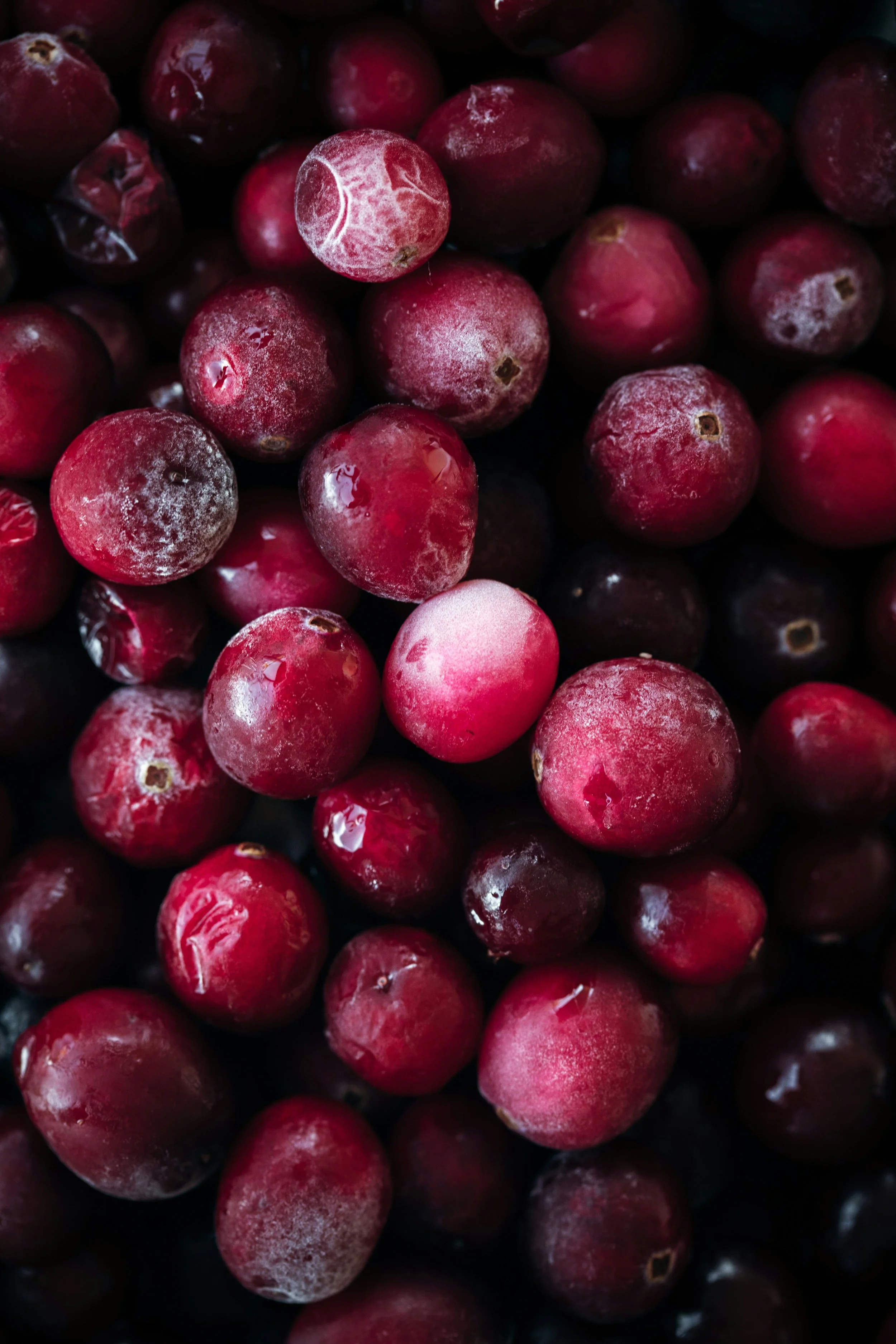
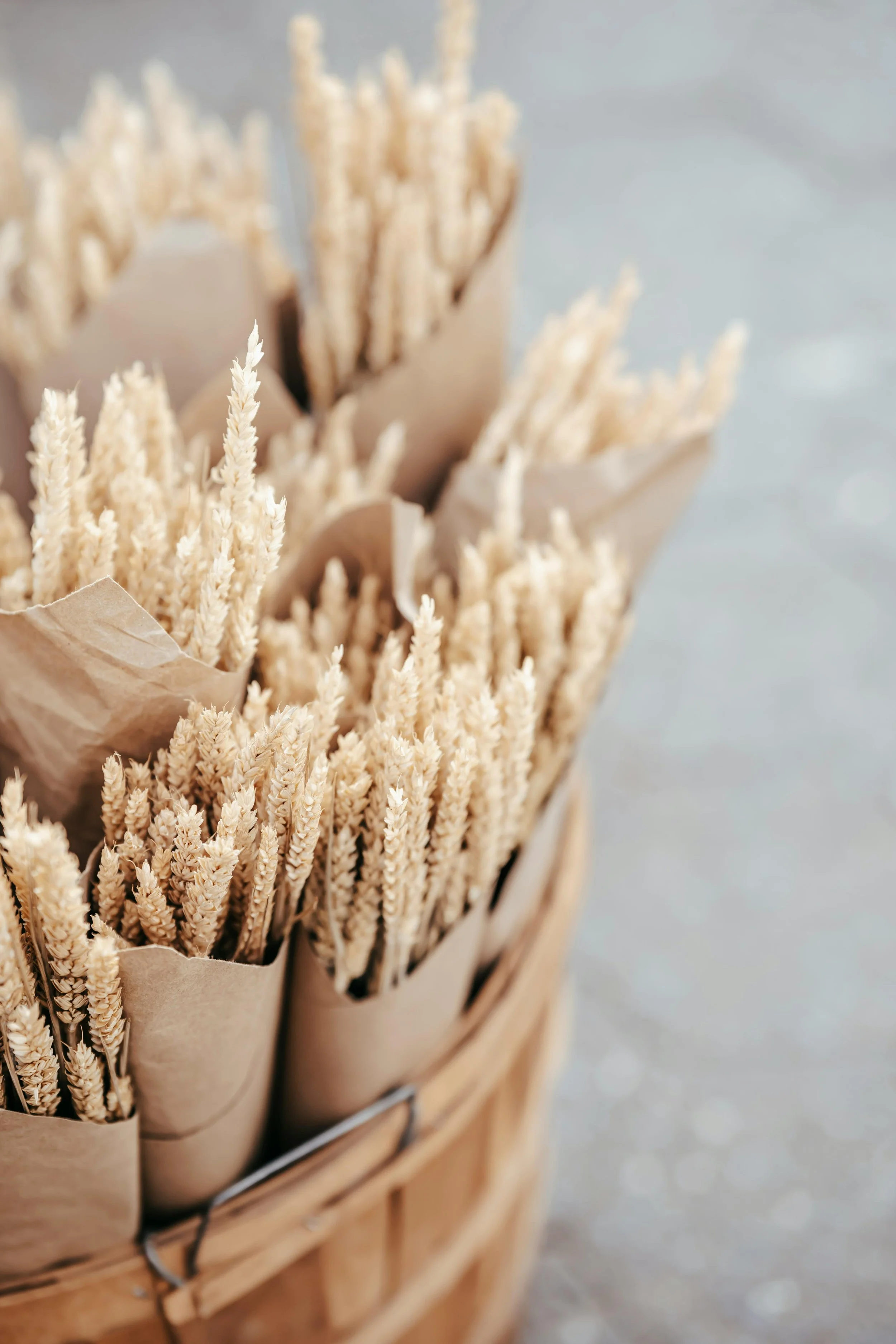
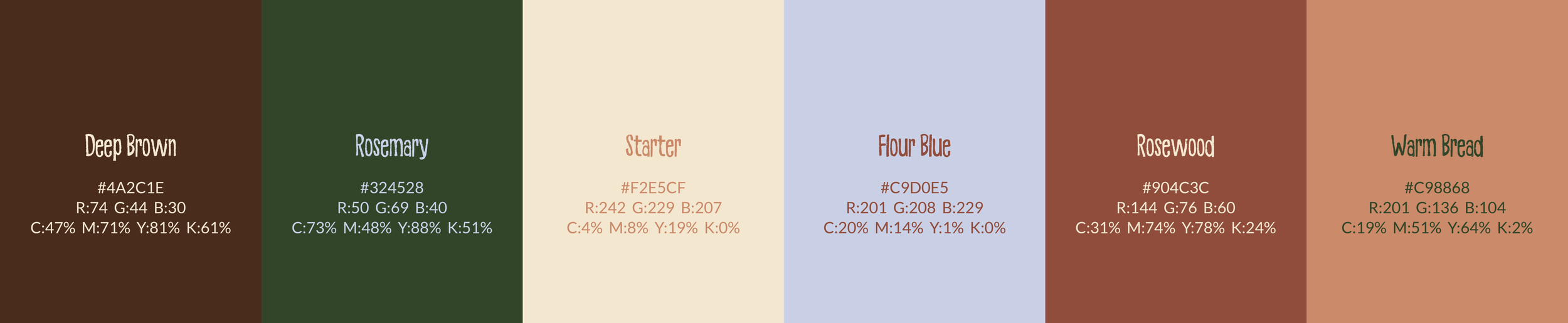
Color Palette: Bright, Fresh, and Natural
Knead Cottage Bakery’s color palette was carefully selected to reflect the bakery’s signature ingredients while maintaining an organic, earthy feel. The warm, natural tones capture the essence of freshly baked goods and the rustic, from-scratch approach that defines the brand. This harmonious palette resonates with the themes of tradition and craftsmanship, creating a welcoming and authentic atmosphere that aligns with Knead’s mission to offer quality, home-baked delights.
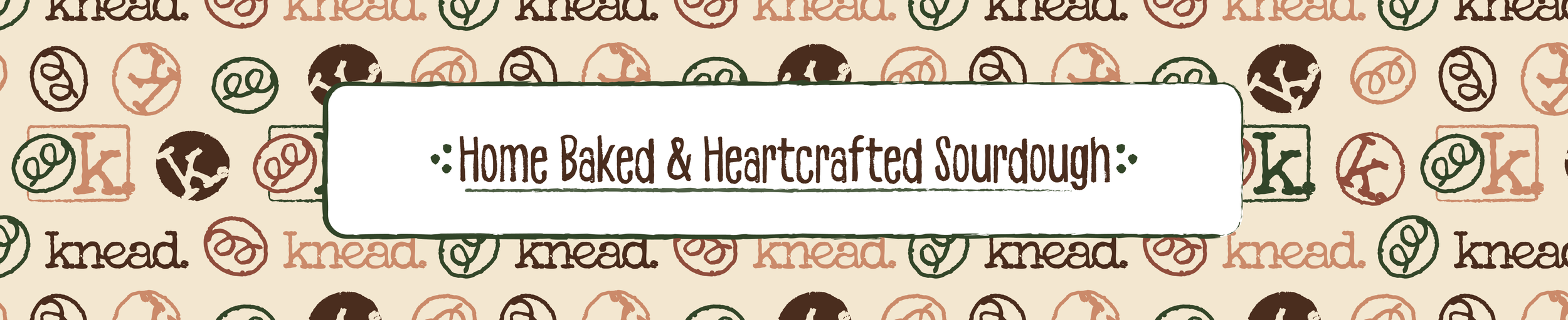
Additional Icons and Patterns
The icons and patterns designed for Knead Cottage Bakery were crafted to enrich the brand's versatility and charm across multiple applications. Drawing inspiration from the bakery’s home-baked, heart-crafted philosophy, these elements add warmth and character to the brand’s identity. Whether featured in print, on packaging, or in digital formats, the icons and patterns offer a cohesive yet adaptable way to extend Knead’s branding, allowing for creative flexibility while ensuring a consistent and welcoming brand presence.
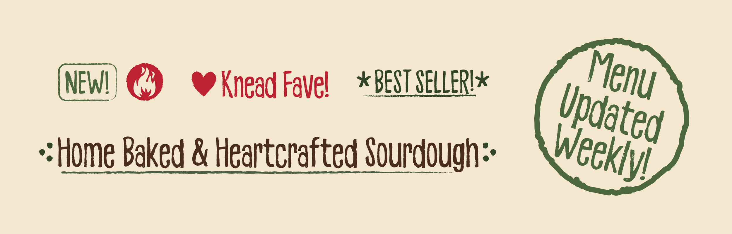
Branded Callouts
Our callouts have been crucial in quickly communicating the unique qualities of our home-baked, heart-crafted goods to customers. These concise and engaging messages effectively highlight the key features and benefits that make our products special. In a fast-paced world with short attention spans, these callouts are vital for ensuring that Knead’s offerings stand out and resonate with our audience.
Production Ready Artwork
Once our packaging concepts are finalized, we apply them to a dieline tailored for the bakery’s needs. The artwork is meticulously prepared and reviewed to ensure accuracy and quality before being sent to our production partners for final implementation.
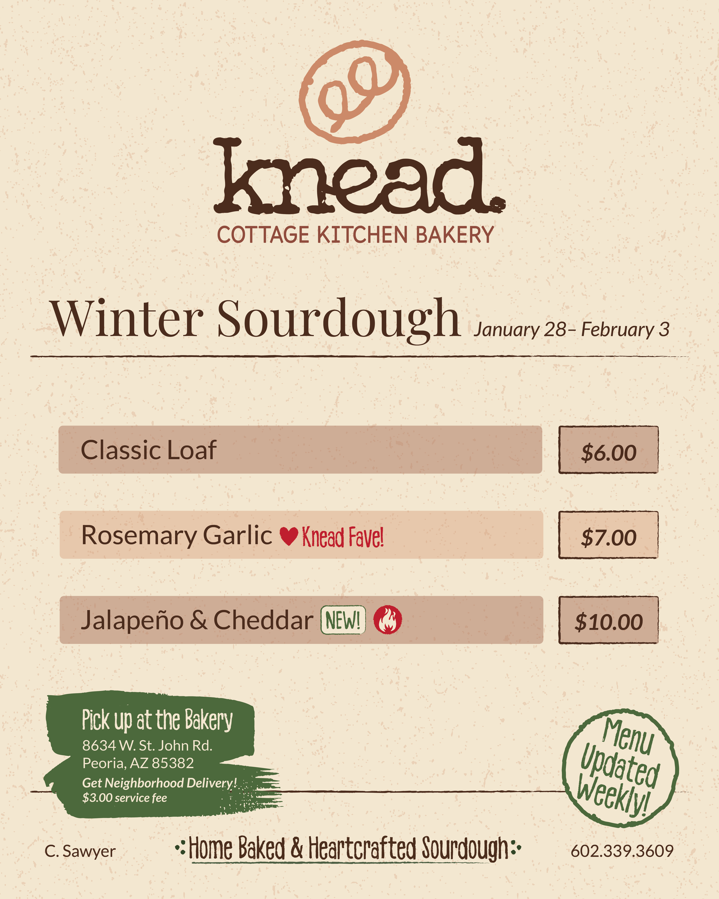
Cindy preferred to distribute her menu updates digitally on a weekly basis. Given that she lacks design expertise and access to design software, I created a customizable template in Canva. This allows her to efficiently update and manage the menu content each week.

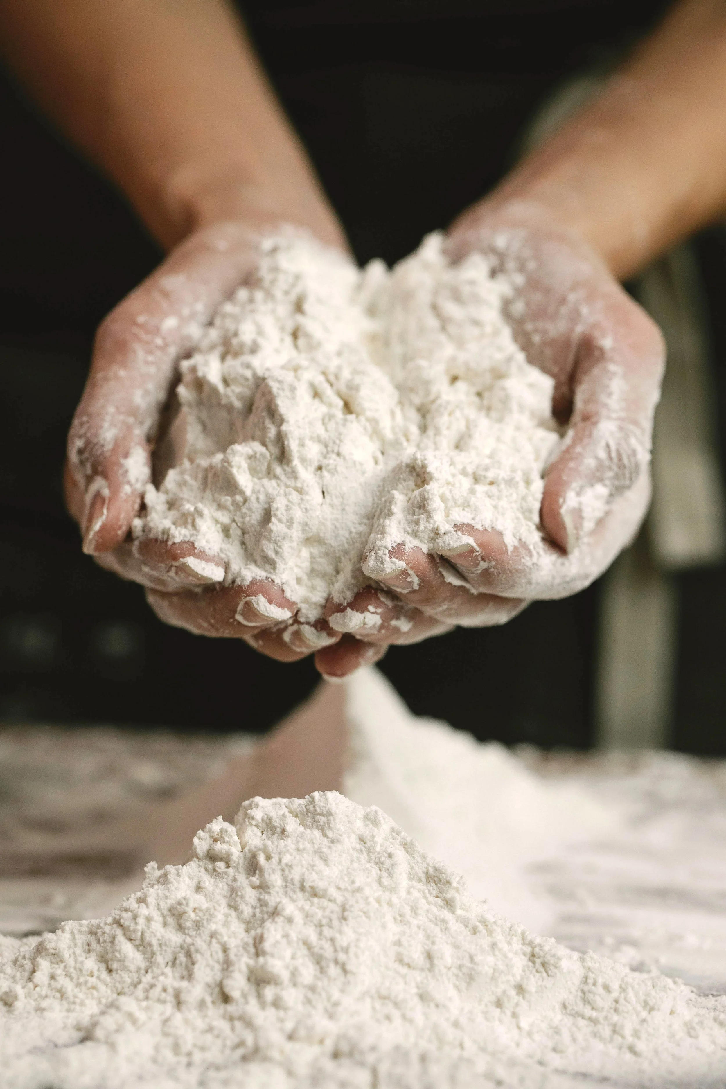
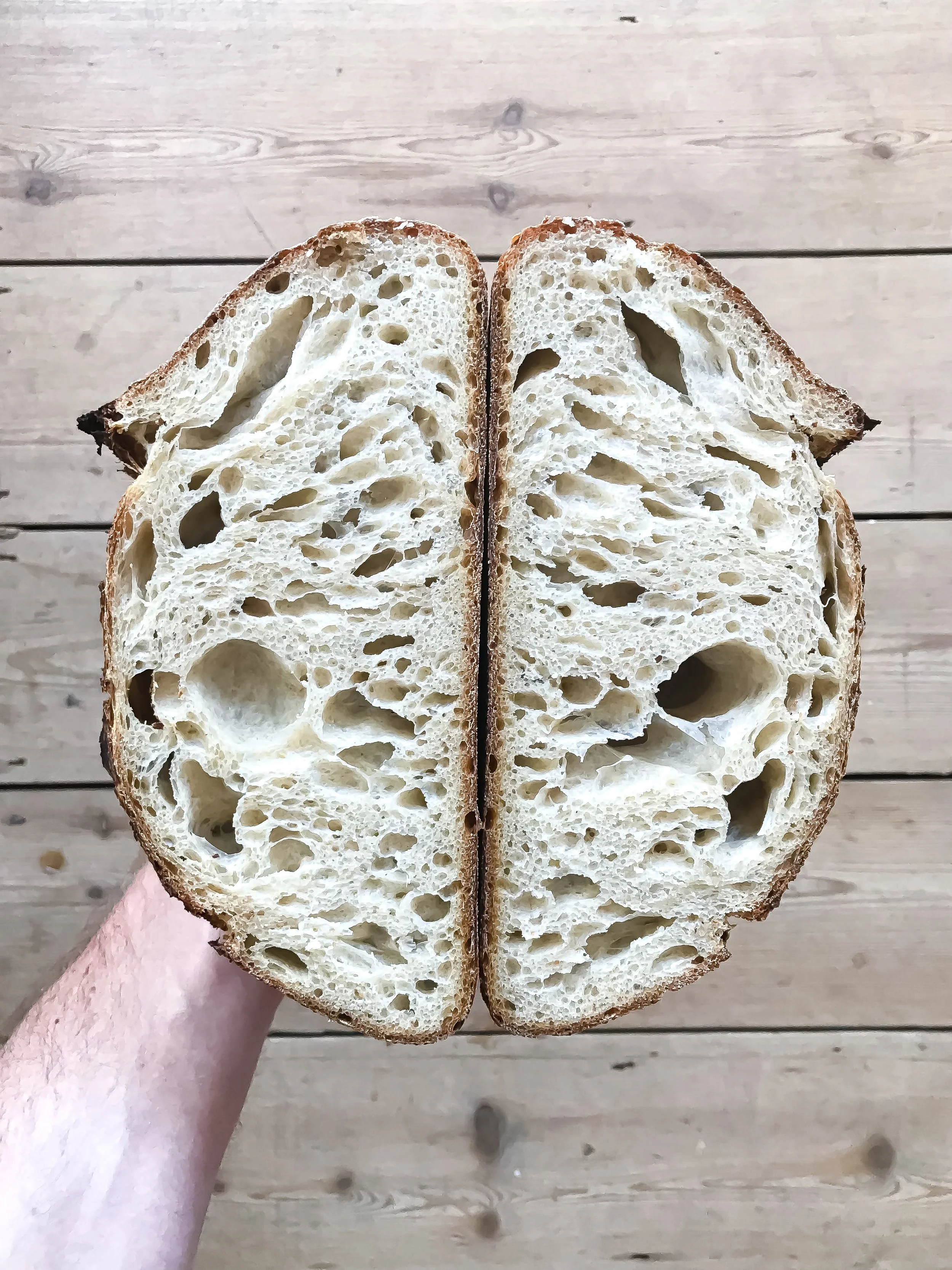
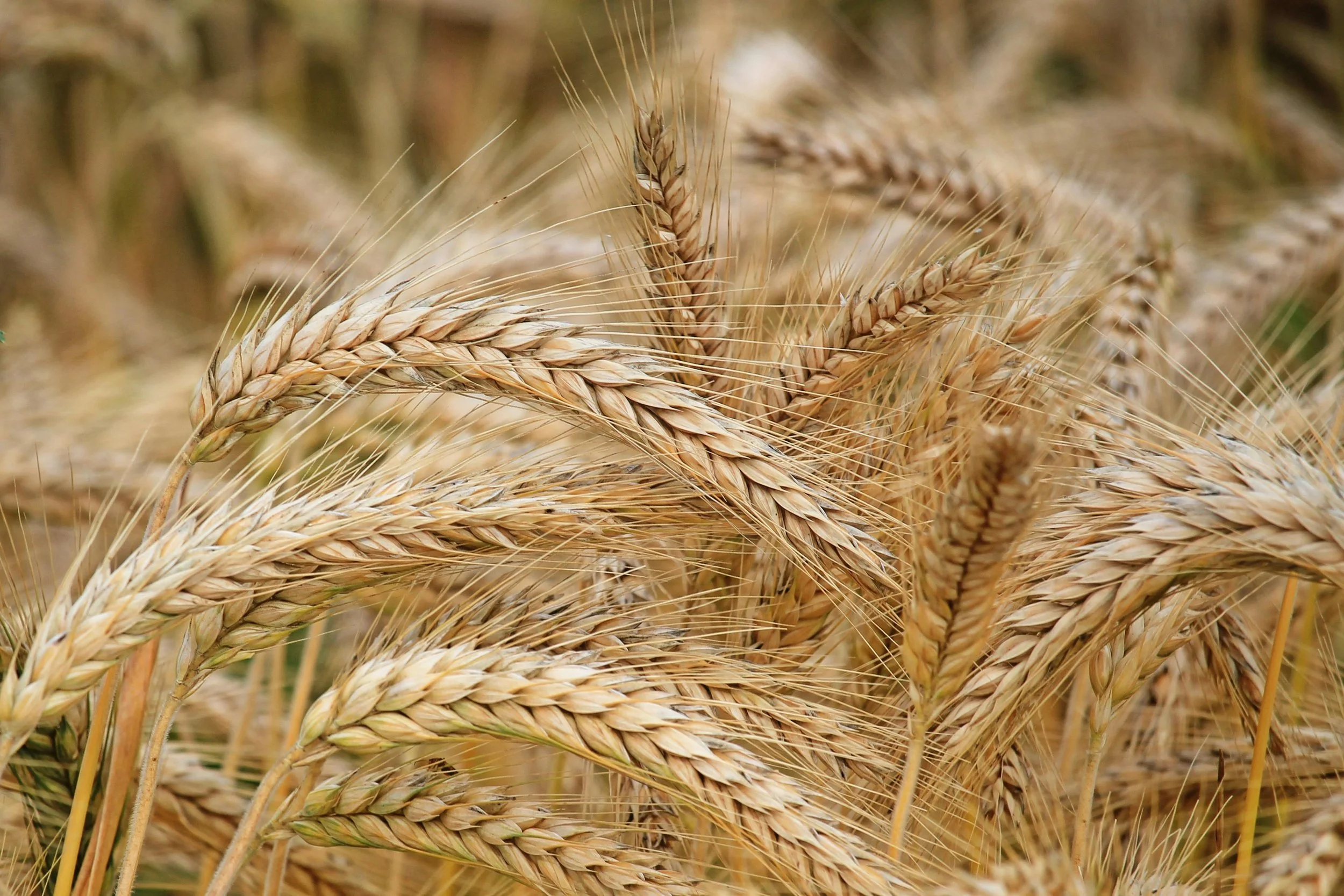
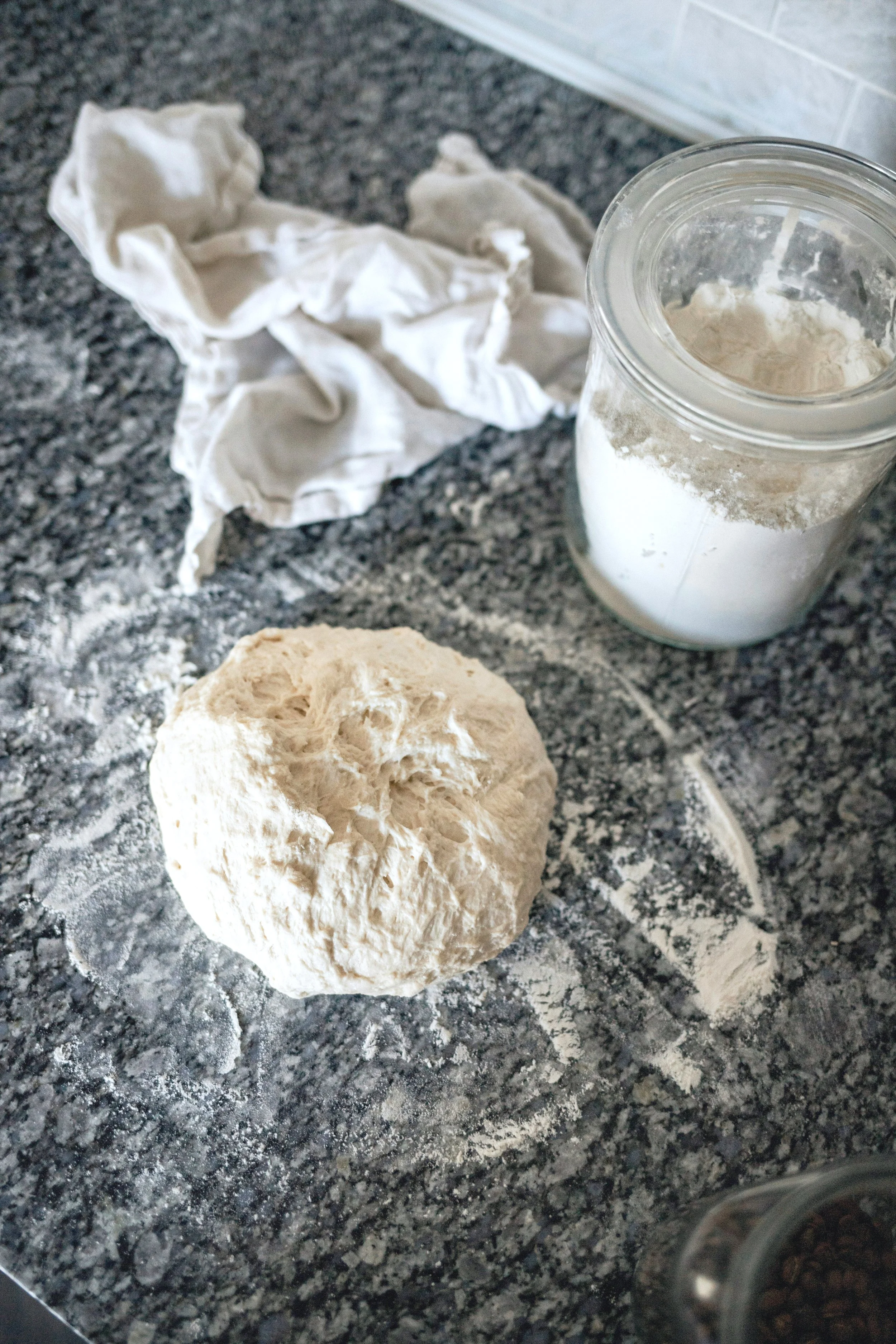
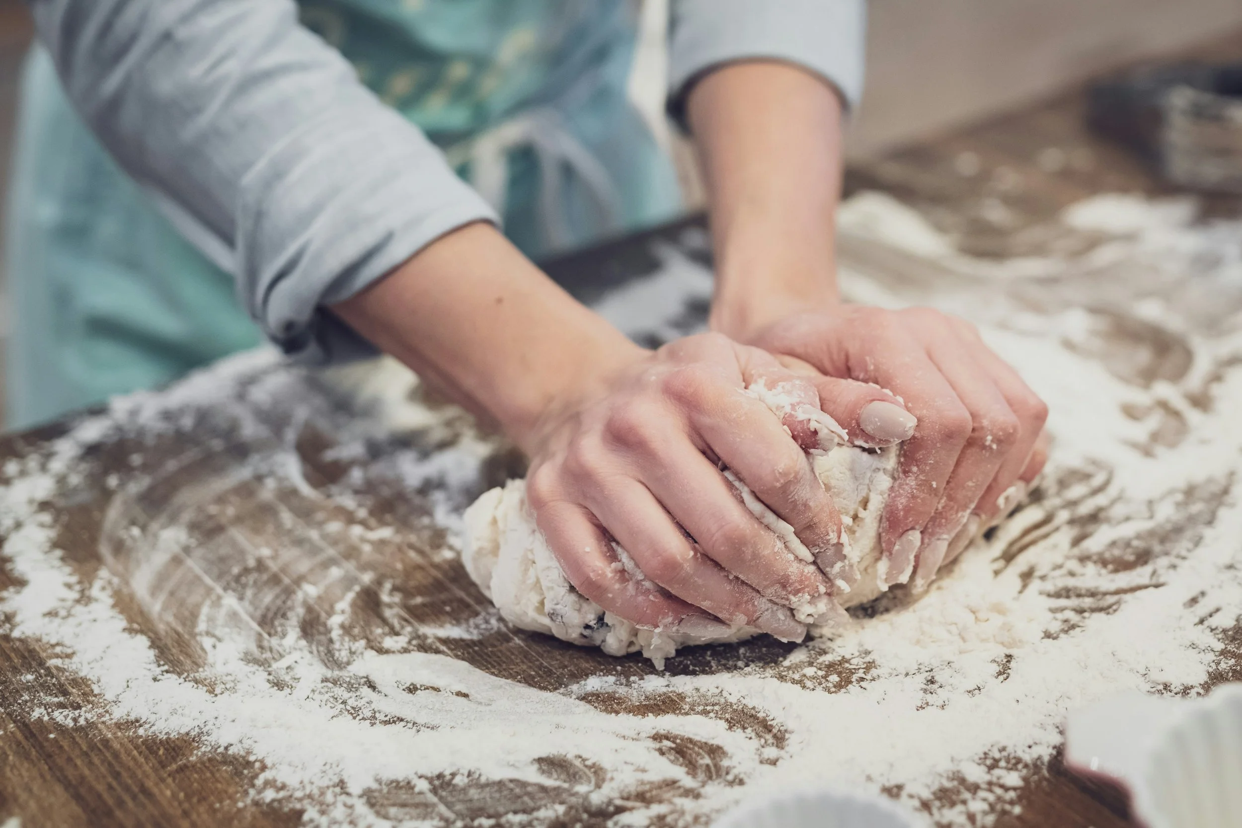
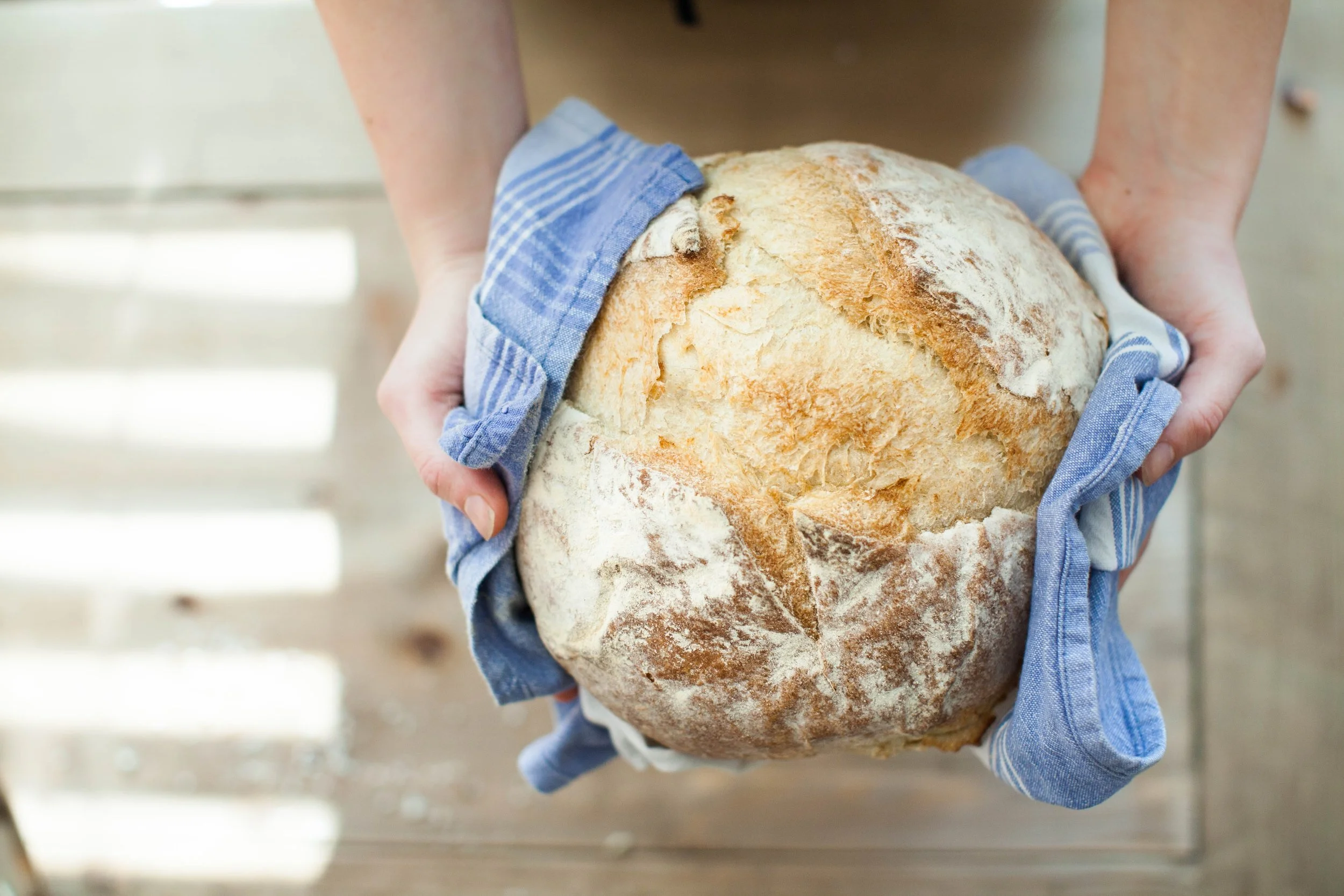
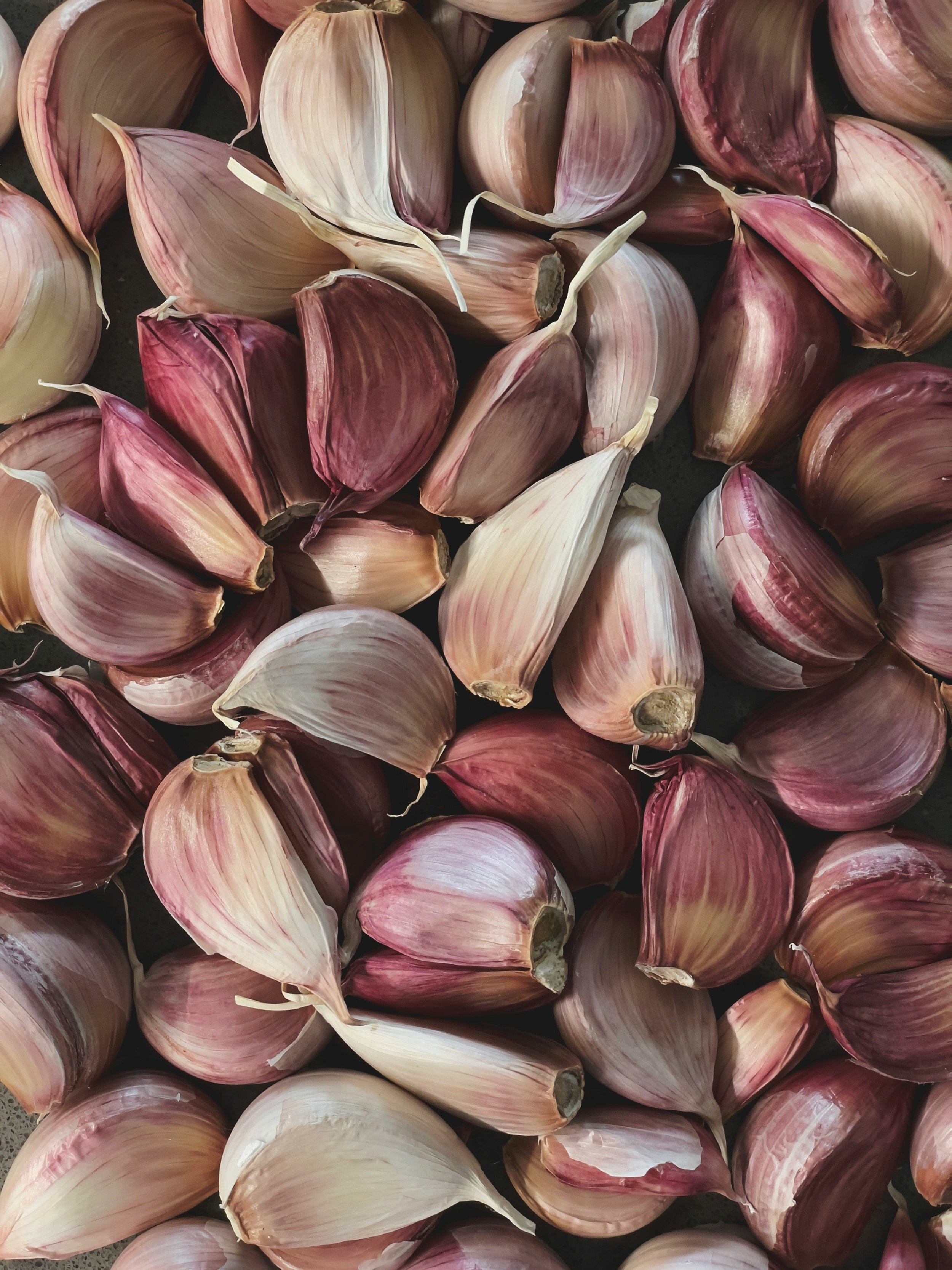
Brand Imagery
The brand imagery for Flourishing was carefully selected to evoke a deep connection with nature and human interaction. Close-ups of natural materials and textures, wide shots of scenic landscapes, and moments of positive human connection are at the heart of this visual identity. These images reflect the brand’s focus on growth, restoration, and holistic well-being, creating a powerful and relatable narrative that resonates with Flourishing’s mission to nurture both mind and spirit.